Project
A DOCUMENTATION PLATFORM
FOR UX DESIGNERS & RESEARCHERS
Summary
Vizable is the next generation design documentation and retrieval tool that supports industry standard workflows from inception to delivery.
ROLES
Product Design
UX Researcher
IDENTIFIED PROBLEM
The one thing that has always bothered me is how little of the insights we uncover in our discovery phases every actually make it into the final product? I know right! Why is that?
1. Visibility of the researched data insights are very hidden,
2. Making it hard for designers and team have access to those insights
3. Which leads to not being able to use those insights and turning them into high level actionable insights.
According to research findings released by Limina, only 14% of today’s organizations are considered Design-Integrated businesses; embedding a human-centered design culture into their organizations to gain both exceptional customer experiences as well as business and financial goals. Of the remaining 86% of companies, 15% are considered “Design-Conscious” taking strong action to move in the direction of integrated design, while the remainder are lagging.
TARGET Audience
This platform focuses on three types of users - Primary: UX Researchers/ Designers, Secondary: Team and Tertiary: Stakeholder in order for designers/researchers to work more efficiently and collaborate with full transparency with others.
MY DESIGN PROCESS
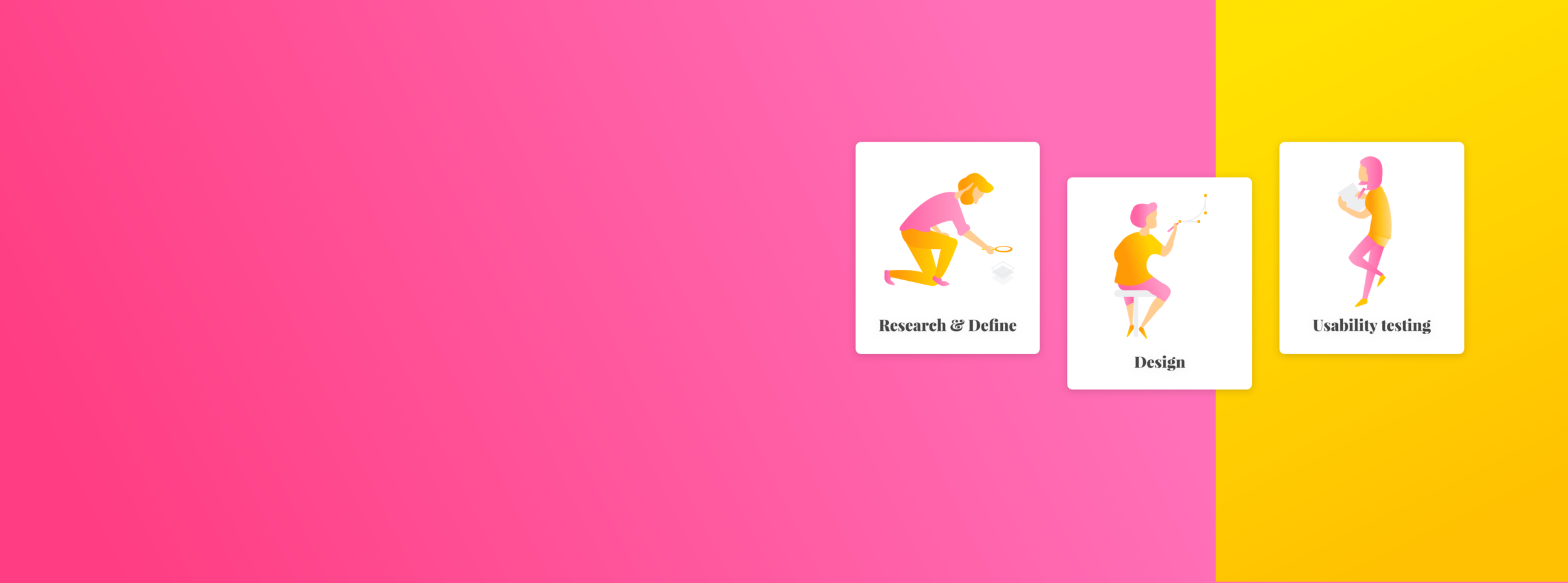
I decided to use the Double Diamond structure to understand my users and their problems. This design process would help me explore creative and innovative ways to understand them.
TALKING TO DESIGNERS & RESEARCHERS
I began my research by interviewing user researchers and designers in Vancouver to make sure that there is a common pattern to the pain-point I was trying to solve. I reach them out on LinkedIn, other social media platforms and through my connections. I was very grateful to hear back from so many talented and amazing designers who were interested in the idea.
“I need to be able to get back to my research quickly and see the summarized version rather than having to dig in piles of files and documents.”
— Zewei Wang, Product Designer
Experience: 2 years
“I want everyone in the team to see the project's process throughout from start to finish.”
— Juhi Jaferii, UX Lead
Experience: 4 years
“Stakeholders usually wants to see summarized findings and how about we came to the decision we make.”
— Karam Mahmood, Interactive User Experience Designer
Experience: 5 years
“There is no time to dig through research data and yet we should be basing our designs on what people said.”
— Sadaf Mahmoudian, UX Product Manager
Experience: 9 years
“Significant information goes missing at times when your discovery phase data is saved everywhere.”
— Felix Lai, Senior UX Designer
Experience: 7 years
“I think having all my design process in one platform would be time efficient.”
— Bradley Smith, Interaction Designer
Experience: 12 years
“There is always a lot of data but how do you structure it all together is key.”
— Maggie Wang, Product Design Lead
Experience: 10 years
DESIGN STAGES
The very first thing that I had to do after my user interviews was research on different design stages to understand the different methodologies used by designers and UX researchers.
For my MVP, it was crucial that there was one general UX design process that could be adapted and work for all kind of UX Researchers and Designer out there. It was also important that all design stages are included in the design process.
FEATURES & PAIN POINTS
I reviewed the recordings and notes from the user interviews and jotted down every possible features that my users wanted onto Post-It. I tried to identify and understand their pain points through the features they wanted.
What others were doing?
At this point, it was time for me to research and explore what tools are out there in the market. I looked at both direct/indirect competitors to understand why they are successful and how VIZABLE could be more focused specifically for its users that are User Researchers, Designers and Stakeholders.
IDEATING THE SOLUTION
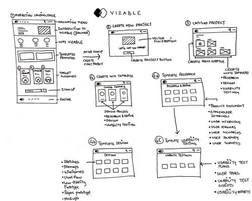
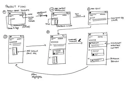
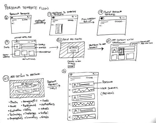
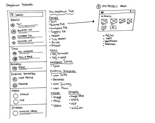
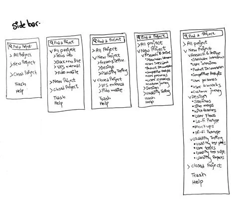
Then it was time to start sketching. I came up with several potential solutions to each of the pain points and made some rough UI sketches. I did some preliminary validation on the Lo-Fidelity sketches and used the feedback to refine my sketches and narrow down my solutions for the Hi-Fi mockups
INitial wireframes
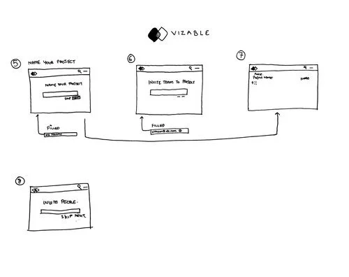
At this stage, I create wireframes to allow me to map out the functionality of the pages, catch problems early with usability testing, and save time on revisions later.
I believe that it is much less painful to make changes to a wireframe than to a high fidelity mockup with lots of design elements.
EARLY USER TESTING WITH UX Researchers and DESIGNERS
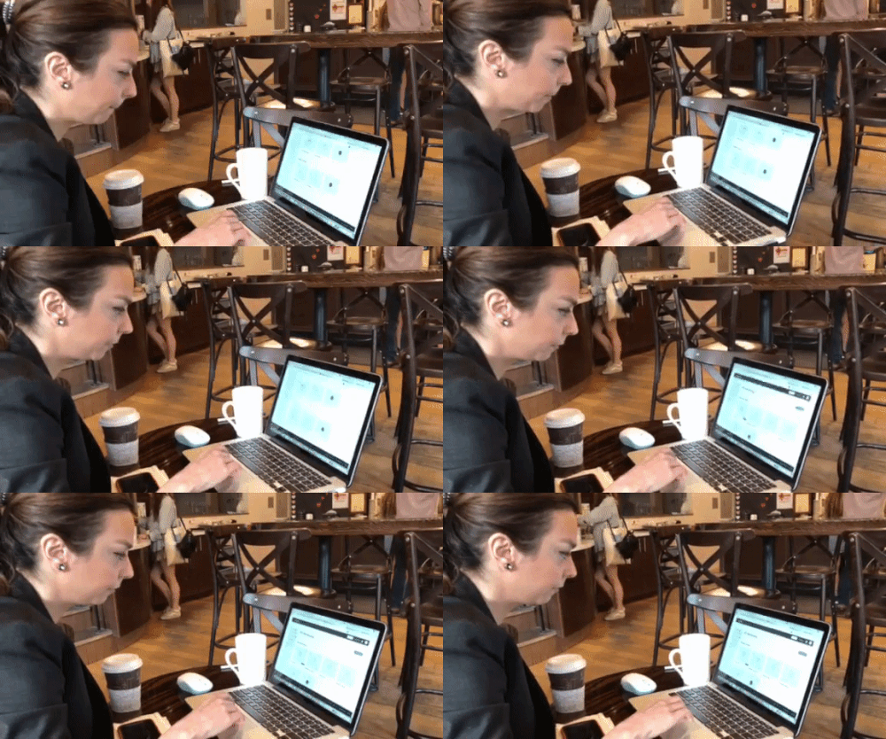
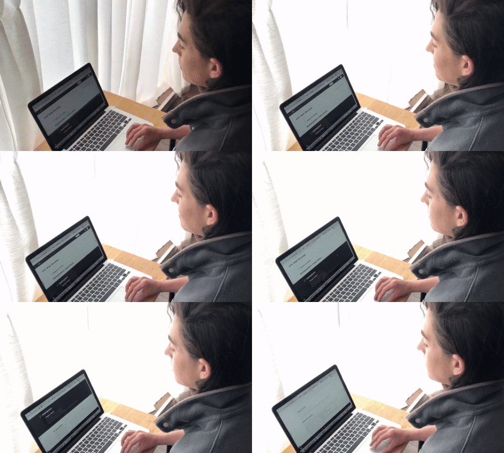
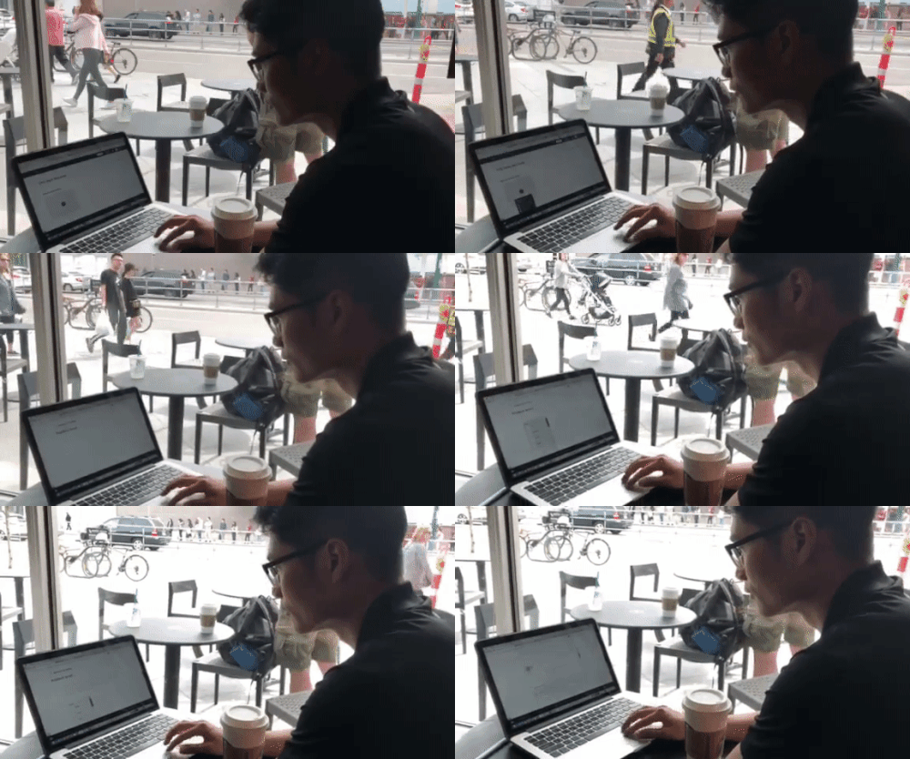
I believe that testing wireframes at its earliest stage is important as to identify any missing or extra requirements. For me, wireframes are also one of the best options to test the usability of a product or application before it is developed.
focused features
For my MVP, I decided on the three most important features which made VIZABLE a specifically tailored tool for it’s users. These focused featured are based on the user interview and user testing where a pattern was identified as to what designers/researchers needed to make their workflow efficient and seamless.
AN INLINE MENU
Quickly add items/ components/insights and more all from one seamless, easy to use inline menu.
HIGHLIGHT
Highlight important data so you don’t every miss any important insights again. The idea was to be able to highlight the main content from the findings in different phases of the design process.
TEMPLATES
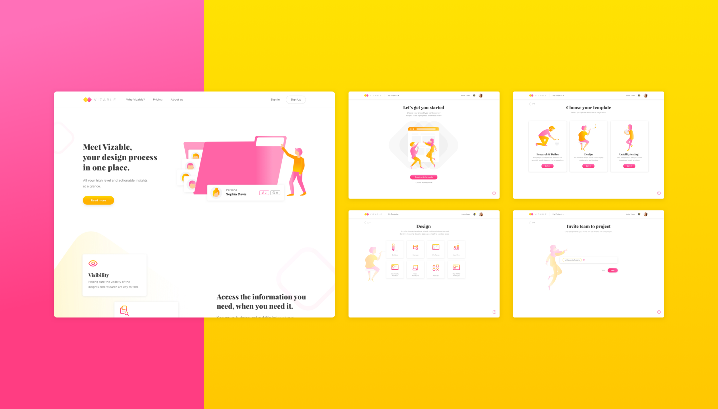
Customize any templates to make it work you. This includes user journey maps, personas, user flows, mental model, affinity mapping and more. Below, I choose to showcase the persona template flows.
VISUAL DESIGN
For my visual direction, I opted for yellow and pink colors because through my research, I discovered that the use of pink and yellow highlighters are the most popular and commonly used. Documenting can sometimes be very dull to do but with my visuals, I hoped to make the experience of my target audience a delight.
COLLECTING THOUGHTS, IDEAS, COLOR SCHEMES & MOODS FOR VIZABLE’S VISUAL CONCEPT
To get the right look and feel for VIZABLE, I spent some time brainstorming and exploring ideas to design my visuals. I have always liked to know about the latest trends in design and keep myself up-to-date. Mood boards are so much fun, they hardly feel like work. Designing loosely let me brainstorm, explore and play with different styles without all the limitations a layout will later impose.
TESTING THE DESIGN WITH DESIGNERS
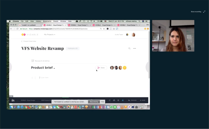
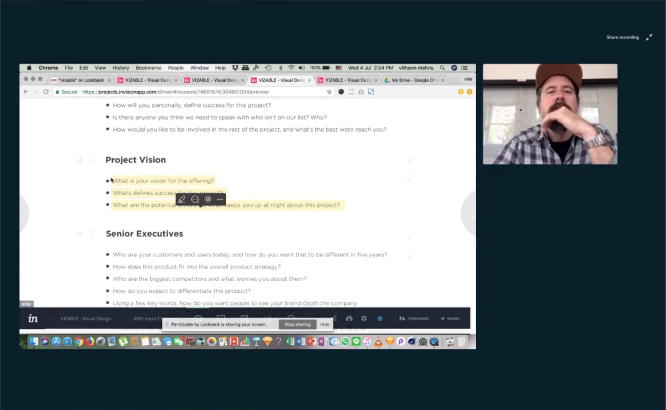
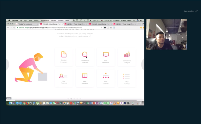
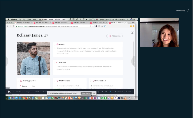
I conducted usability testing with my target audience to ensure my user’s satisfaction with the product. The objective was also to find out if the requirements of different kind of designers and researchers would be too different from one another.
PITCHING VIZABLE’S IDEA & CONCEPT
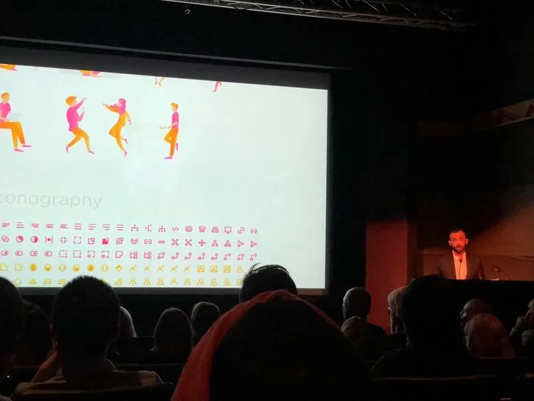
Then it was the moment of truth, where I got to present the concept of VIZABLE to the world and among such great talents from the design industry in Vancouver. It was a night to remember for me!
THE CHALLENGES
ALL-IN-ONE
One of the toughest challenge for me was how could I create a platform that had everything relevant for the researchers and designers in one place without getting in the way of their existing workflow?
SWITCHING PLATFORMS FOR DESIGNERS AND RESEARCHERS
When I was in the early phase of this project, I was told by many designers that it is very hard to convince them and others to switch from their existing platform to a new one. If I remember correctly, one of the designer said that “it has to truly be something that helps me save time and collaborate better with my team with complete transparency”.
When I was working at a digital experience consultant firm, I came across this problem I am trying to solve myself so it was important to tackle this pain-point and prove my idea and concept with the help for designers/researchers out there. At the end, I was able to convince a lot of them that it would be much more efficient and effective to work and collaborate if this kind of platform did exist.
SUCCESS METRICS
APPROVAL OF DESIGNERS & RESEARCHERS
In conclusion, I believe that this project was appreciated and acknowledged by User researchers and designers. Out of 23 designers/researchers, 21 of them said that they would actually like to use this tool and make the work flow more efficient and seamless.
TESTED ON A REAL PROJECT
I got the opportunity to test the prototype of Vizable on a real on-going project, where I asked the team to document their design process from start to finish on the platform and identify if it would be something useful and help them to save time, collaborate better and be transparent throughout the project.
It turns out that the team felt that instead of opting for multiple platforms to document their process, a platform like Vizable could be an answer to have the whole design process in one place.
VIEW NEXT PROJECT


