
Project
ACCESSING PRIVATE COLLECTIONS
THROUGH 3D PHOTOGRAMMETRY
Summary
"A Seat at the Table" is the current exhibition at the Museum of Vancouver that explores historical and contemporary stories of Chinese Canadians in BC and their struggles for belonging.
ROLES
UX Design
Product Design
Design Sprint Facilitator

my responsibilities
Designed and delivered an interactive digital experience from wireframe concepts to final production and asset creation for the “A Seat at the Table” exhibition.
Collaborated closely with engineers, 3D designers and project manager to generate high quality 3D scans of artifacts for visitors to appreciate from a 360-degree perspective.
Researched on users behaviour and motivation at the museum and on other museums to gather insights about the latest trends on their applications.
Led UX vision, created UX workflows, built quick prototypes, hi-fi and lo-fi mockups.
Conducted usability testing with museum’s 08 stakeholders, 11 visitors and 05 internal team.
Current Exhibition at the Museum of Vancouver.
(2020-2021)

PROBLEM
With more than 50,000 artifacts at the Museum of Vancouver, items from public or private collections are at times too big, too fragile or located too far to be presented in the museum exhibitions.
Therefore, can result in visitors losing the chance to admire and see these artifacts up close which can effect their overall experience at the museum as artifacts can be sources for better understanding the history and a way of approaching the past.

OPPORTUNITY
The interactive component is an opportunity for visitors to access key artifacts (6-10) connected to the history of early Chinese immigrants to British Columbia that can’t be displayed in the “A Seat at the Table exhibition.
Access would take the form of high-quality 3D scans of the artifacts where users would be able to pivot and observe the objects from a 360-degree and zoom in on the artifacts.
OBJECTIVE
Because the museum only gets to show a fraction of their collections, their objective with this project was also to acquire the legacy document and templates that they can use to create more high-quality 3D photogrammetry for other exhibition by their internal team.
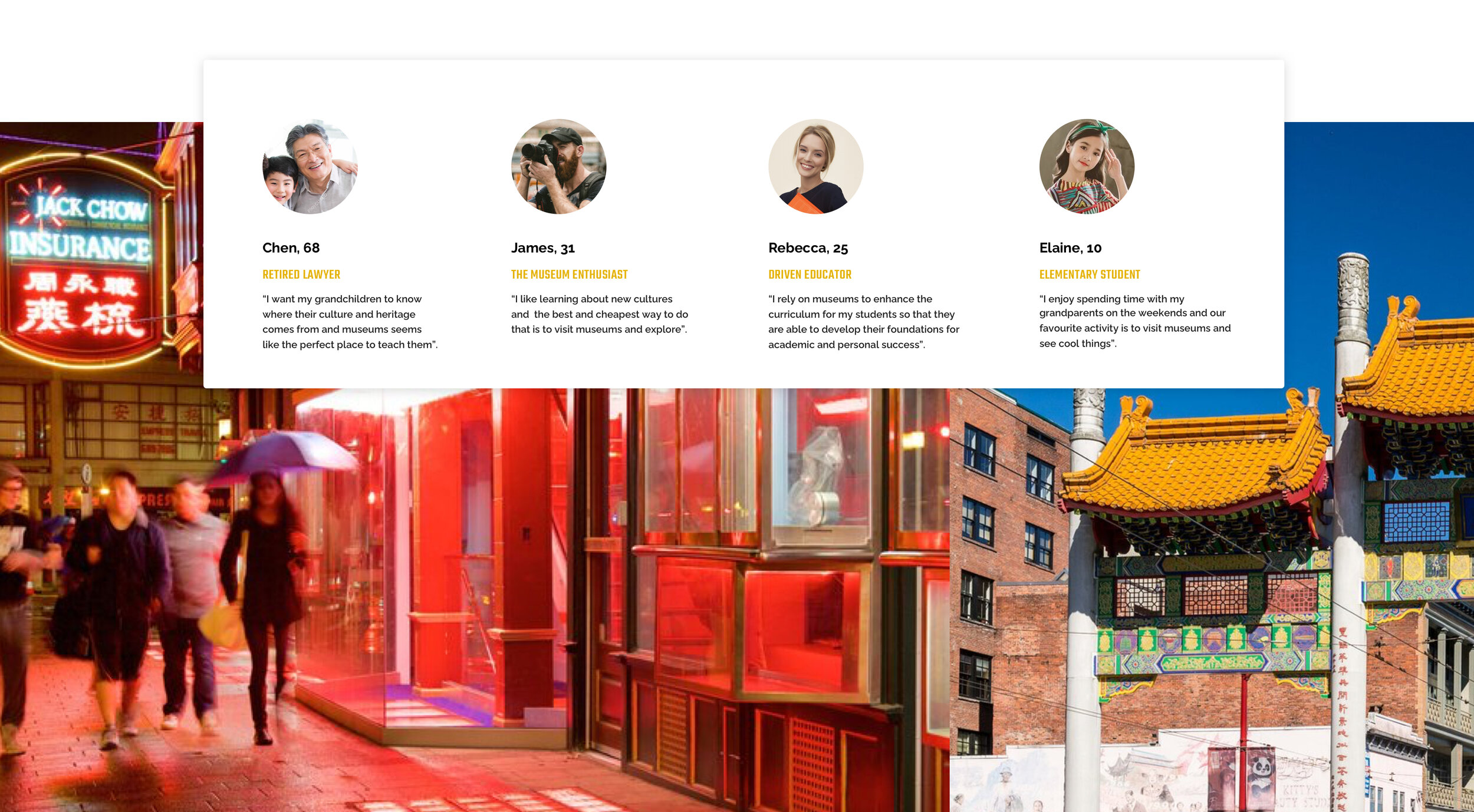
TARGET PERSONAS
The design brief required the interactive component to be appealing to the museum visitors from 10 years old to seniors which primarily targets elementary students, educators, museum enthusiasts and older adults.
USER STORYBOARD
Based on the target personas, I sketched out user scenarios to visually show what the story of the visitor might be from the time they learn about an upcoming exhibition to visiting the museum. This also helps to align the context and vision with the client and internal team in understanding user’s motivations, needs, pain-points.

COMPETITOR ANALYSIS
Simultaneously, I also initiated researching on major art & history museums around world, more specifically on existing digital exhibits in traditional Chinese art style as I wanted to get the look and feel the visual design right.
One such application that I came across was, The Forbidden Palace Museum. The aim of this app is to show the hidden precious collections that cannot be shown to the public for various reasons. The application gave me many insights on how to display the artifacts in both english and mandarin, but the artifacts shown were only in 2D.
However, it’s extension app, The Ceramics Gallery in the Pocket provided me with valuable reference of an interactive digitalization of artifacts in 3D.
Although in the Ceramics Gallery people could interact with the artifacts, they can only rotate an artifact in 360 degrees on the x-axis. My final design will instead allow users to rotate the artifacts in 360 around any axis.

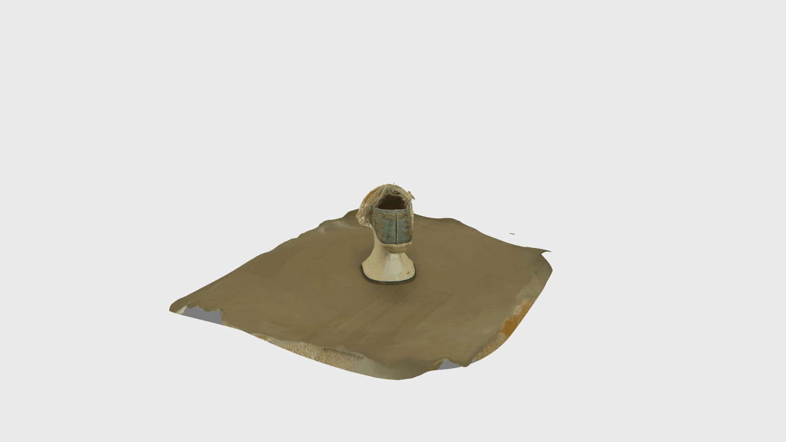
OUR 3D PHOTOGRAMMETRY PROCESS
At this stage, I collaborated with the 3D designers and engineers to digitalized the artifacts that were provided by the museum to form high-quality 3D scans where users would be able to pivot and observe the objects from a 360-degree and zoom in on the artifacts.
The process consisted of manually photographing the artifacts in different angles and heights to importing them to Autodesk and Zbrush for clean up to designing 3D environment for each artifacts and uploading the final outcome on to Sketchfab.


RAPID PROTOTYPE TESTING
The test was conducted with 38 users from age 13 to 65 years old consisting of elementary school students, museum enthusiasts, older adults and museum’s internal team members.
The purpose for conducting the test was to understand if user’s found the overall flow intuitive and easy to use. I had to keep it mind that the age group range is wide so testing at this early stage with them was essential to gather their feedback and insights.
Out of 38 users, 36 of them found the flow to be “straight forward”. However, I observed that there was one key problem in the flow that needed to be solved. User’s were taking a lot of time to decide which artifact to view first which meant hoarding the screen and could be a pain-point for the next user waiting in line. I felt that the UI design for this page needed to show some of the artifacts at once instead of displaying it one by one.

TRY PROTOTYPE
I created task based question for the usability testing and here were some questions.
Questions:
Imagine you are using the MOV app for the first time. Your task is to find the “Reticulated Ball” Artifacts and view it in 360 degree perspective.
How was your experience with the overall flow of the app?
If you could change anything in it, what would it be?
Is there something you absolutely like or dislike?
Between the different environment setting of the artifacts, which one do you prefer and why?

What People Are Saying
“I found the flow to be pretty straight forward but i would prefer having fewer text on the description of each artifacts.”
— Valentina, 26, Elementary school teacher
“3D Scans looks professional and beautiful. Plus the Ui Design visually is fantastic and structured well”
— Sean, 47, Museum’s internal team member
“Add an option of audio voice over if the user wanted to listen to it while interacting with the artifacts in 360 degree perspective .”
— Miguel, 32, Museum’s internal team member
“Prefer Realistic environment background for artifacts over Solid color background as it helps tell the story of the artifacts better and looks so much more interesting.”
— 36/38 users choose realistic background
UI Design
While I had to maintain the brand style guideline for the exhibition which was provided by the client, I had to also incorporate what user’s wanted into the visual design for this experience. The client were more than happy with the suggestions I provided as I based it on user’s feedback.

FINAL PROTOTYPE
I made a video for the final prototype of the digital experience as a part of the legacy document to provide the client with templates they could use as a guide for further 3D scanning and photogrammetry work.
try prototype
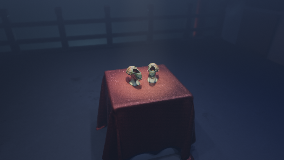
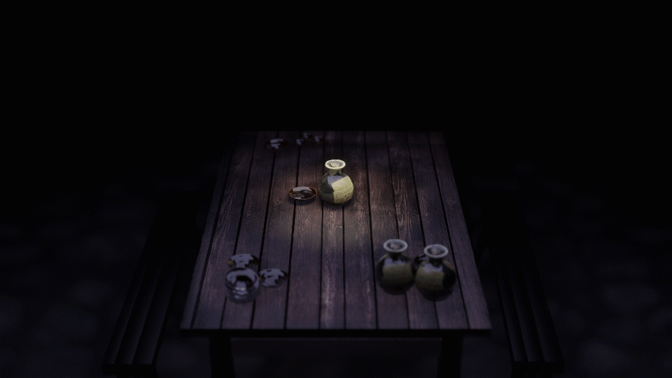
ENvironment design for 3d artifacts.
I researched on the era the different artifacts were from in order to create a realistic environmental background for the each artifacts. I felt that instead of just showing the artifacts in simple black background, users would enjoy the experience more if we provided realistic background to them. I tested between simple black background versus with a real environment and almost all the users preferred to see the objects with realistic background.
I collaborated closely with 3D designers in my team to get each environment right and according to the time.


CHALLENGES
INTERACTIVE EXPERIENCE
One of the main challenges with the UI design was how to keep the overall flow of the experience short and get to the point where users find the artifacts they want to view and get right into it. This prevents the user from hogging the screen for too long as its a shared space and other user would be in line.
The other challenge was the legacy documentation for the client that was to help the museum digitalize more artifacts in their storage and help preserve them. The document I created had to be in detailed on all the success and failure experiment that our team did so that their internal team do not repeat the same mistakes.
3D PHOTOGRAMMETRY
Some artifacts like the cantonese opera shoes has very complex texture on it and it was very hard to capture those texture manually. It took us many photography rounds to get the texture details. We had to play around with lights and shadow to get it right.
Objects which were shiny was also a major challenge for our team to capture the details. We solved the problem by modelling some of the objects in Maya in order to get the correct look of the artifact.
KEY TAKEAWAYS
It was my first time being involved in a 3D photogrammetry project so it was a huge learning experience for me on how it is done and what is to be expected. I feel that this project has taught me how to think and design for 3D.
